Friday, January 22, 2010

In what ways does your media product use, develop or challenge forms and conventions of real media products?

During the process that led to my final three pieces I kept in mind the conventions of a war trailer teaser. From an early stage I decide I wanted to work with the war and action genre but because of my audience research I decided to include some elements of comedy. Although these twists are not shown in the teaser if I was to make a trailer or an actual film, the comedic side will be shown through the characteristics of Lucky (one of the main characters).

https://blogger.googleusercontent.com/img/b/R29vZ2xl/AVvXsEg-E7pS_V1PsiybHbZ0SYKICW1Zn_ciU6ikS8lKB6TMpvMEo8Wxi1enPSPP-TRZM8xzI-GWANXQl-BKwGANFkuZrZrlXRNRFdLo3q3DQveVX8YK_K5Ygsv8X3yEDWJGJhKy9TRbjHXIpbO1/s1600-h/Slide4.JPG

Most common signifiers of the horror theme is extreme close ups of a weapon or a scared face, atmospheric music, running, blood and screaming. I understood and therefore was able to use/explore these conventions because of earlier product research.

I think it was important to retain some elements seen in most war teasers because it makes it identifiable to/for the audience when making a choice on what film to view. Having said this it just as important to challenge convention and the status quo because when you do right it is likely to attract the maximum number of audience and it will give you a unique selling point which will help to compete and separate you from rival films.

The poster

Below I have identified some of the common features you will see in must film posters, so in this sense I have not challenged any conventions.


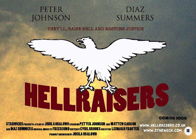
The title has a wrap effect because the pressure of the eagle is weighting it down. I went with this idea because I thought it would make it look more realistic.

Slogan

The goal of any film poster essentially is to sell and promote the movie, to make the audience want to see it. Some of the typography included in my poster include the movie title in a big and bold red font. I chose the design, colors, and fonts to try to reflect the mood and tone of the film. The poster includes a catchy sentence or slogans that pique your interest and make the plot seem intriguing. Mine was “they’ll come, raise hell and restore justice”, using the rule of three and “Veni, vidi, vici” (I came, I saw, I conquered) Julius Caesar it made the slogan more catchy. I placed the actors' names at the top of the poster because I wanted to use them as a marketing tool.

The visual elements on a movie poster can convey powerful messages. The best posters make you anxiously anticipate an upcoming release. By having just the eagle as the main image I feel it created an element of mystery.


Teaser

Taking inspiration from the research I did earlier I feel there are similarities between my work and other teaser. These similarities are:

Props

The use of props in not only teaser trailer but any media text is important because it can be used to establish aspects of the narrative, such as time (for example the future).
In the teasers I viewed there is a presence of a weapon that can hurt or kill enemies
Most commonly the weapon the hero has is nothing compared to what the villain has, this is done to make the victory the hero experiences at the end much more significant. I replicated this trend by creating dynamite (with candles).

Examples below

https://blogger.googleusercontent.com/img/b/R29vZ2xl/AVvXsEg3WO7wE3JD9DkKcyjpaIcGVWnRbcRCCsT3K-bRrW4f_Md2FqGeQlyhKKcmJg-PF_xcuDg69yANeeosmWqOQBMyH_CP20Zj9qZgCZwHwt9H_xSSplZZkcyhiQoXTMv6tkKKEE_9Xx__ftVy/s1600-h/Slide8.JPG


I found when choosing the music and soundeffects to use in my teaser really easy. I found it on a website freesound.org, it a database for copyright free music.
The sounds I used include:
A main sound track (played though)
News reporters (starts at the first newspaper cutting)
White noise (first thing you hear)

Thursday, January 21, 2010

How effective is the combination of your main product and ancillary texts?

As a package, the purpose of the teaser (main product), the poster and magazine (ancillary tasks) is to promote a film through different media outlets. The aim is to reach different audiences at different times. The poster can be placed in a number of places that is accessible to that target audience. When researching the demographics of my target audience (specifically 18-20 years old), in relation to their spending, it is unlikely that they will have a car so they will use public transport. Investing in an advertised campaign, which involves poster on buses and at train stations could increase future profit. The poster can easily be also placed in magazines and newspapers for example The Guardian, The Sun, Empire and Metro.

A teaser can be said to be the most persuasive medium of the three products I have constructed. This is because it features “action packed” footages that will appeal to the audience. The teaser can be shown in cinemas before films of a similar genre; this ensures that the intended audience learns of the movie. It can also be shown on TV during prime time (7-10).


Across my products I have some aspects are consistent to emphasize the link between them (an example below).The eagle is one of the key concepts of the movie and by having it across my production gives an emphasis to this fact.


I feel that overall they all compliment each other and I was able to create a clear idea and concept for the film.

What have you learned from your audience feedback?

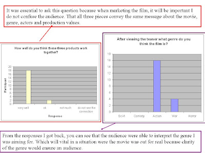
After I finished my production work, I used Facebook and questionnaires to gain my audience feedback. I asked 20 people between 18 to 34 (target audience) to view my work. After collecting back my questionnaires and reviewing some responses on Facebook, I was able to look at the alterations that needed to be made objectively. Here is some of the feedback I got.

One of the main improvements that was pointed out that needed to be made, was the shoots that were used. They gave too much of the plot away, which is the opposite of what I wanted to achieve. To reverse this I needed a bigger range of shoots and possibly a faster pace editing.


One of the strengths of the teaser was the sound effects that were used, it adds more dimension to the clips.
Overall I learnt the teaser is a good piece of work but needed a few alterations.

How did you use media technologies in the construction and research, planning and evaluation?

I feel that through out this whole process I have used the technology available to me to the fullest. The technology I used includes Imovie, Photoshop, Internet, GarageBand and Paint.

I used GarageBand when creating the dialogue that will be used in the teaser. I placed the dialogue with the extreme close-up of one of the main led character, a combination of both was going to be the pirate message they send to their next victim. I change the of the recording because logically that is what the characters would do so that their voice would not be recognised, it gave the narrative some credibility.


My Flag

The original image of the eagle was taken from the Internet. I chose the eagle because it often represents protection, strength, courage and wisdom. A representation of the eagle is it is often used as a symbol or emblem for the military, which works well with my products. I made changes to it to suit the ideas of my movie. These changes were done through different programes.


I used Paint to make the initial changes e.g. getting rid of the gold canister its holding.


I used Photoshop to make the rest of the changes for example putting the Hellraisers title inside the eagle and adding colour.


The image below is shown on my magazine cover and at the end of my teaser. The use of red and black for my final pieces hints at the genre because these colours denotes horror, terror and blood which are conventions of the genre I am working with. In my original mock up I wanted the title of the movie to have a glow about it because I wanted them to have an almost angelic aura. Due to limitations on Photoshop I decided to have a plain white font. The colour white has pure and innocent connotation.


The Internet

I found the use and access to the Internet to be essential to my A2 media work. This is because I used it during my product research and the construction of my pieces, for example the creation of the background for my poster. Without the internet I would not have been able to transfer my ideas from paper to the computer. Over the last twenty years the use of the internet as grown and so has the data. Through the internet I was able learn tutorials and research for my different media texts.


(http://jibola.blogspot.com/2010/01/how-i-created-background-for-my-poster.html).


The images I used for my magazine cover was taken from the internet, for example the international stars frame. The film projector and world globe were separate images but by changing the opacity of the globe and then shrinking it, I was able to make it look like the image of the world was being projected from the projector.


Photoshop


In the creation of my work, I spent a lot of time using Photoshop. I was able to utilise the abilities of Photoshop by using it in a three productions.

http://www.hesido.com/base.php?page=tutorials&sub=wavingflag


The images that were used in my poster and magazine were taken with a SLR camera. The backgrounds for the magazine and poster are actually the same image but because I wanted to create different moods I made changes using Photoshop. For my teaser I used a HDV camera for most of the filming and also used a Mini DV camera. With the aid of a tripod and tracks I was able to create scenes from my mock up.

Wednesday, January 6, 2010

How I created the background for my poster?

Step 1

When thinking about my poster I did not want the sky to be clear and blue. I wanted it to look like a sunset. I could not take a picture of a sunset so I created on using photoshop. I chose a picture of the sky I took my self as the background of my poster, and then I found an image of a sunset from the Internet. 

MY PICTURE 
SUNSET FROM THE INTERNET 

STEP 2

Next I need to match the color of the sunset with the clear sky I took. To this I went to the match color option in the image option of the toolbar.  The picture I took of the sky will now take on the color attributes of the sunset image. The effect was too much so I adjust the fade slider until I was happy with the result. 


FINIAL PICTURE